Original Colour Scheme
This website uses bright, uplifting colours to improve the mood of the person viewing it. The original palette takes inspiration from the bold and vibrant colours used in pop art.
The palette was extended to darker and lighter shades.

#FFEB46
#D35383
#35D6B5
#5E3293
#59ABE3

Then the contrast of different combinations were tested. This not only checked the ease of readability but also the aesthetics favourable to the eye

Below are the final combinations with the highest contrast ratios.

5.72:1
11.74:1
8.55:1
9.76:1
6.69:1
10.80:1
Final colours in a 60:30:10 ratio


old site map
Site Map and Ideation
The goal of this website was to create a smooth journey from beginning to end whilst needing as little effort to move between projects. The old site map tried to create a better experience by having quick access to multiple pages from each page. This led to a confusing journey and has been resolved in the new version.

new site map
Wireframes


Features
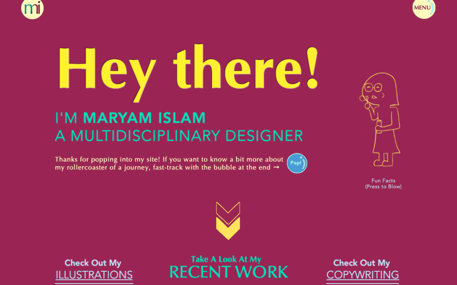
This website uses interactive elements across it, keeping it playful and engaging to the audience. Such as the bubble-blowing mascot on the home page. Pressing it blows bubbles showing fun facts.
Another goal of this site was to be accessible. Maintaining high colour contrast was a way to make the site easy on the eyes especially for those who are visually impaired. This was achieved through testing and readjustment.